Hello world :: #wintergilesv3 “Iseabail”

17 06 2008

Hello all,

Proudly announcing the release of wintergilesv3, codenamed “Iseabail Kathryn”.

Born at 9:18 AM on Tuesday the 17th of June 2008.

Proud brothers Oscar and Gus, alongside Mum and Dad are elated and tired.

Thank you to the great people at Calvary Hospital in the ACT for your help, support and outstanding care.

Pictures available on Flicr here: http://flickr.com/photos/wintergiles/

More to come. Watch this space, or watch the flickr.com site.


My way home

26 05 2008

I started a new engagement today, which is nothing really new. But today for one reason or another I found myself much liking the way I went home.

I found myself thinking, I wonder what all my friends think or see on their ways home. What do they see, what do they go past, what’s their experience of the trip home from a hard day earning a crust?

Well for those of you who are interested in my answers to that question, please read on.

The following flickr set, is a series of chronological photos taken by my mobile phone, on my way home from work.

The photos are terrible, but to me, that didn’t matter, because the pure and simple peaceful act of taking some rough and ready photos of a small part of my life, is what it was about.

What I loved about that singular trip home, the variance in the environment I travelled through, the beauty of the sunset I saw, contrasted against the architecture I passed through, the smell in the air when I got home, and the open stars above me after a hard day.

http://flickr.com/photos/90882470@N00/sets/72157605262944195/

So without further adu…. the “On My Way Homeme”.

Rules:

– Use a simple camera, the simpler the better,

– Upload them to flickr or whatever your preference is, but as long as they can be seen through the web,

– Tag them if you can with “onmywayhomeme”,

– Blog it and tell the story,

– Tag your mates.

easy.

I hereby tag:

Sarah

Miles

Garry

Nick

Nathanael

Ruth

Stephen and

Andrew


Is User Centred Design only for software?

19 05 2008

I had a conversation today, which was I interesting and enlightening.

We were talking about User Centred Design, and the person I was talking to, let’s call him “Bob”, was all fixated on how UCD was born from the IT age.

I of course argued to the contrary and being an Industrial Designer (actual buttons that you click with your fingres and so on)

You see, UCD in all it’s forms and even as simply as a reseraunt, asking the customer how they like their coffee and thus changing the menu.

It’s alive in the automotive industry like nothing else. Look at the features that appear in the new cars each year, how do you think they arrive at what is on that list? how do you think motorcycles (the finest and most incredible machines this world has ever known) have become such highly focussed and purposed solely for integrating the human with amazing speed and grace?

I digress. But to make my point, I’ll look at a new different product all together. A perambulator.

Specifically a terriffic one made by Britax (Steelcraft), called the “Strider”.

We just got one for our new kid. Me being me, I reviewed it quite carefully when we were purchasing it.

To me, took up the role of the technical, financial, and coach buyer. The boss took up the role of the User buyer, as well as a little bit of the financial buyer.

From my perspectives, having reverse engineered the design, and the product itself:

Technical buyer:

– it’s machined nicely, with all the fittings, … fitting well, and operating it is easy, and well thought out, for a human to work, (who has two hands, TWO not THREE Bertini)

– it was made from good quality extruded aluminium.

– it had solid motion through all its joints, and bushes moved silently without catching or rubbing.

– the tyres were airless, and thus would never run flat, and could have the tread replaced.

– the wheels pop off, and the bassinet pops off easily to reduce stack height when folded down.

– light weight, with minimal plastics and over complicated jointing systems.

Financial buyer:

– in terms of construction cost to produce the item, to the obvious quality standard, seemed reasonable. Easily besting the “could I build it myself for less?” question.

– in terms of quality in comparison to the other things on the market (ahem …http://www.bugaboo.com/ @ $1500AUD for a pram!) and versus the more economical bretheren, certainly seemed to offer good value for money.

– Because of the inherant quality of the product, wear and tear or lifespan questions are well met.

Coach Buyer:

– Because the financial buyer and the techncial buyer (which is a common male role to play in such a decision) were happy, the Coach buyer was provided with many good things to help coach the User buyer into a position of purchase. Why? Because it came with this terriffic two part brochure, the one set of pages, had all the technical information and instructional information I in my roles (and as a male) would want. Plus!!! it had all the information I would need to be able to support my actual decision maker in her decision.

Of note, it wasn’t a con, or underhanded in my view. Because Britax gave me all the information I wanted to know, and made the product in such a way that it addressed my concerns, my job in my role was made easier.

From the Boss’s side, she got great usability, reassurance from her technical and financial buyer that the thing was good, and to boot, because the financials were reasonable.. heaps of extras for bub.

Which suited me also.

So where’s the UCD in all this?

I’ll ask you this.

We bought the pram. We’re happy about it, we like it, like to use it, and had no post purchase buyers remorse.

How do you think the company could have achieved that, if they DIDN’T ask users what they wanted and then acted upon that information?
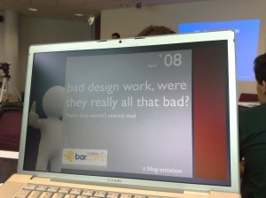


Bad designs, were they really all that bad?

19 04 2008

Barcamp presentationWell today is the first Barcamp in Canberra and it’s shaping up to be a blast.

To follow what’s happening at the event, you can follow on twitter by adding @barcampcanberra.

At this event along side a gamut of much more fantastic presenters than I, have played my part and put together a little something for us all to have a look at.

I did a presentation on bad designs, and explored a bit in a short 15 minute window, a few points that take a bit of the ‘dis’ out of reviewing a bad design.

The slide pack (bad-design-at-barcamp) and at slideshare goes through a few gems from the 90’s, and some points as to why they mightn’t be so nasty… from a certain point of view.

THE CHALLENGE!!!

I laid out a challenge to all who attended, and you to, to nominate a horrible site, and either thump down a case for why it sucks or why it’s great, but still sucks.

The rules are pretty simple:

1. no questionable material if you please.

2. you can’t just nominate a site, you have to state why it’s good or why it sucks.

3. sites must be truely horrible.

So to participate, just comment away.

I’ll be participating as well, and I’ll be trying to stand behind any of the horrid, torrid, utterly nasty sites you find.

Game on everyone.


What the heck ever happened to the 90’s?

9 04 2008

I remember being a senior designer for a company (who shall remain unamed) with a friend of mine James Peek (sparkos.com) doing all sorts of design work but mainly for online sites.

Back then, 100kb was considered big for a site, and even deal breaking if you were the Government.

Nowadays, I’m willing to bet no one hardly ever thinks about the size of the page, well at least that’s the impression I get anyway.

Look at this!:

Apple.com (on 9/4/2008) – 576Kb

ebay.com.au (on 9/4/2008) – 596Kb

Microsoft.com (on 9/4/2008) – 264Kb

Adobe.com (on 9/4/2008) – 716Kb

Amazon.com at a scale tipping (9/4/2008) – 1MB

See now the way I see it, it’s almost broadband bloat. It’s almost a given to many designers that broadband will be in place for the end user, so we have no issues about making half megabyte sized web pages or worse (tutt tutt Amazon.com).

I recall the day when a friend of mine was gloating about how he developed a space invaders clone within 1, yes ONE kilobyte!

Now maybe I’m being a bit of a fuddy duddy, but surely SURELY 1Mb front pages are a bit irresponsible and just plain lazy. Back in the day, I along side my fellow pixel pushers, used to go to great pains to ensure the graphics were web optimised, so they would be light, and load quickly, thus not annoying the wholly bejoinkers out of the end users.

Heck we even got so tricky as to use background colours in our …. *grimmace* table cells to save pixels downloaded.

I think James even managed to do a client side web page editor in flash with under 150Kb at some point, AND it had font controls even!!!!

Of course this all raises the next question, with the advent of mobile browsing, and all that it entails (dodgy wireless broadband radio cards and so on) are we heading back to the 90’s? do the now current interface designers need to take some lessons from us old hands, and start to think about getting our websites on a bit of a pixel diet?

I think so…. I think so indeed.

ps, well done James for your site still being trim taught and terrific at a miserly 84Kb.